SMALL-SPACE DESIGN GUIDE
A small living room rarely feels cramped because of its floor area alone. More often, it feels smaller because the furniture interrupts movement, every wall is visually busy, or the room is trying to perform five jobs without a clear plan.
The good news is that layout problems are usually easier—and cheaper—to fix than size problems. You may not need a new sofa, a renovation or a perfectly styled set of matching furniture. You may simply need a clearer route through the room, a better focal point and fewer pieces competing for attention.
This guide walks through the small living room layout mistakes that have the biggest effect on how a space looks, feels and functions. The measurements are given in both imperial and metric units, with flexible options for renters, families, tight budgets and homes around the world.
Small living room layout mistakes: the quick summary
| Layout mistake | Why the room feels smaller | Best first move |
|---|---|---|
| Everything hugs the walls | The centre feels empty while conversation feels disconnected | Pull one or two pieces inward and create a seating group |
| The route cuts through the seating | People weave around furniture and the room feels obstructed | Protect one clear path from entrance to destination |
| Too many tiny furnishings | More legs, edges and gaps create visual noise | Replace several weak pieces with fewer useful ones |
| Bulky or deep furniture | Usable floor space disappears even when the item technically fits | Measure depth, arms and required clearance—not only width |
| The rug is too small | The seating looks fragmented instead of unified | Place at least the front legs of the main seats on the rug |
| The television dominates | Every seat faces a black rectangle and social use becomes awkward | Create a second focal point and angle one seat toward the group |
| Only one ceiling light | Dark corners visually close in | Add task and ambient lighting at different heights |
| Low, narrow curtains | The window and ceiling appear smaller | Hang the treatment higher and allow fabric to clear more glass |
| Every surface is decorated | The eye has nowhere to rest | Leave intentional negative space around meaningful objects |
1. Pushing every piece of furniture against a wall
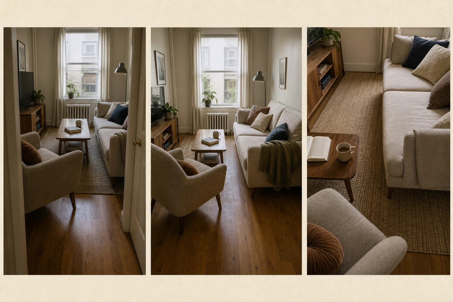
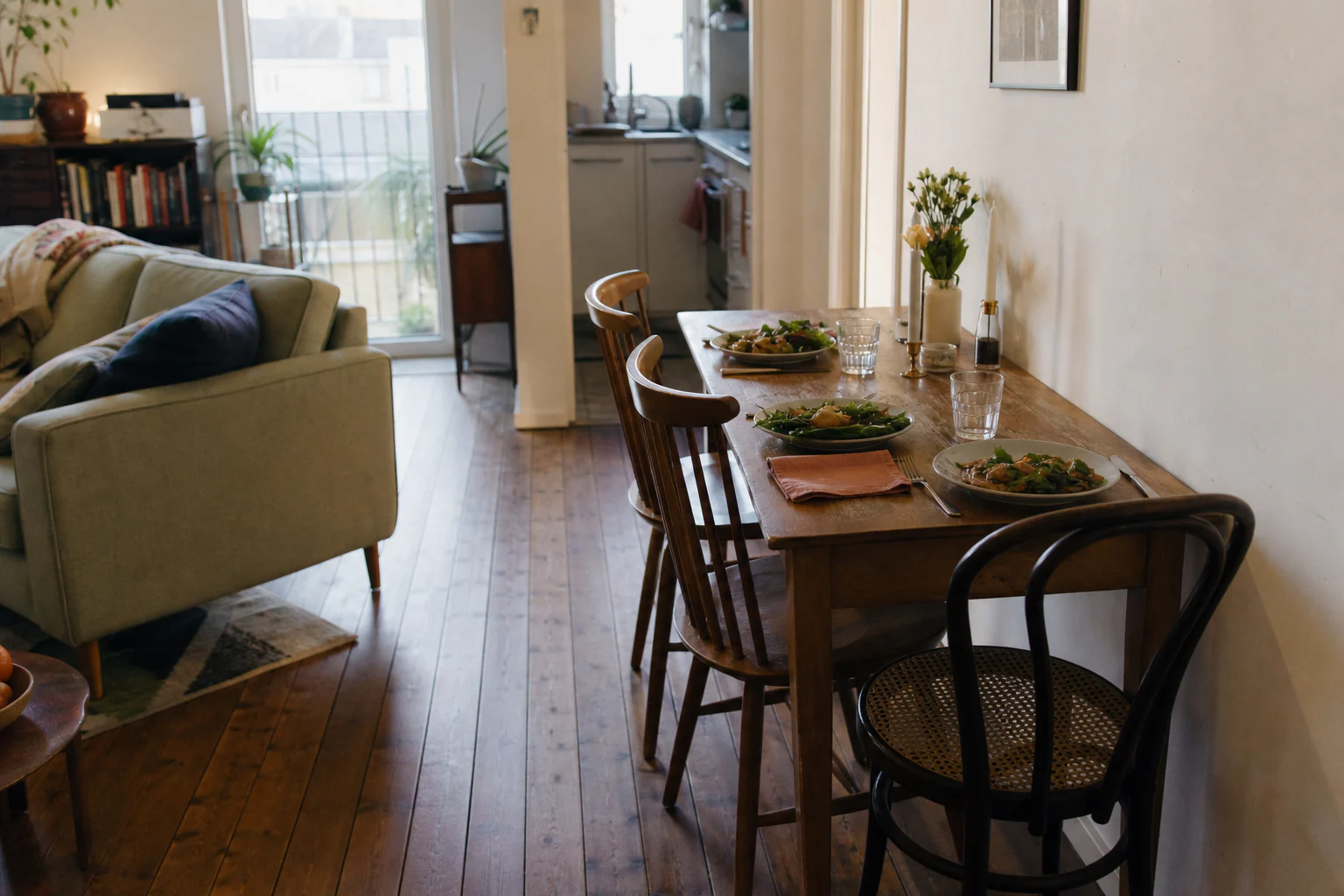
- 01The pinched route
- 02Furniture with breathing room
- 03The seating footprint
“Move it against the wall” sounds logical when floor space is limited. Sometimes it is the right answer—especially in a very narrow room—but doing it automatically can create a hollow centre and a line of disconnected furniture around the perimeter.
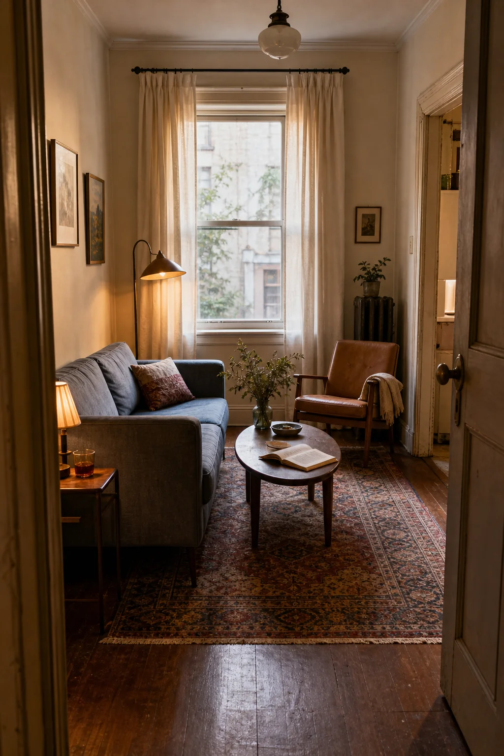
A living room feels more generous when the seating reads as one purposeful zone. Try bringing a chair slightly toward the sofa, turning it inward, or pulling the sofa just 3–6 inches (8–15 cm) from the wall. That small shadow line can add depth without consuming meaningful space.
Do not float furniture simply because a design rule says you should. A sofa against the wall may be the most efficient solution. The goal is connection, not a compulsory gap. If the sofa stays against the wall, use the rug, side tables and chair angles to visually gather the seating.
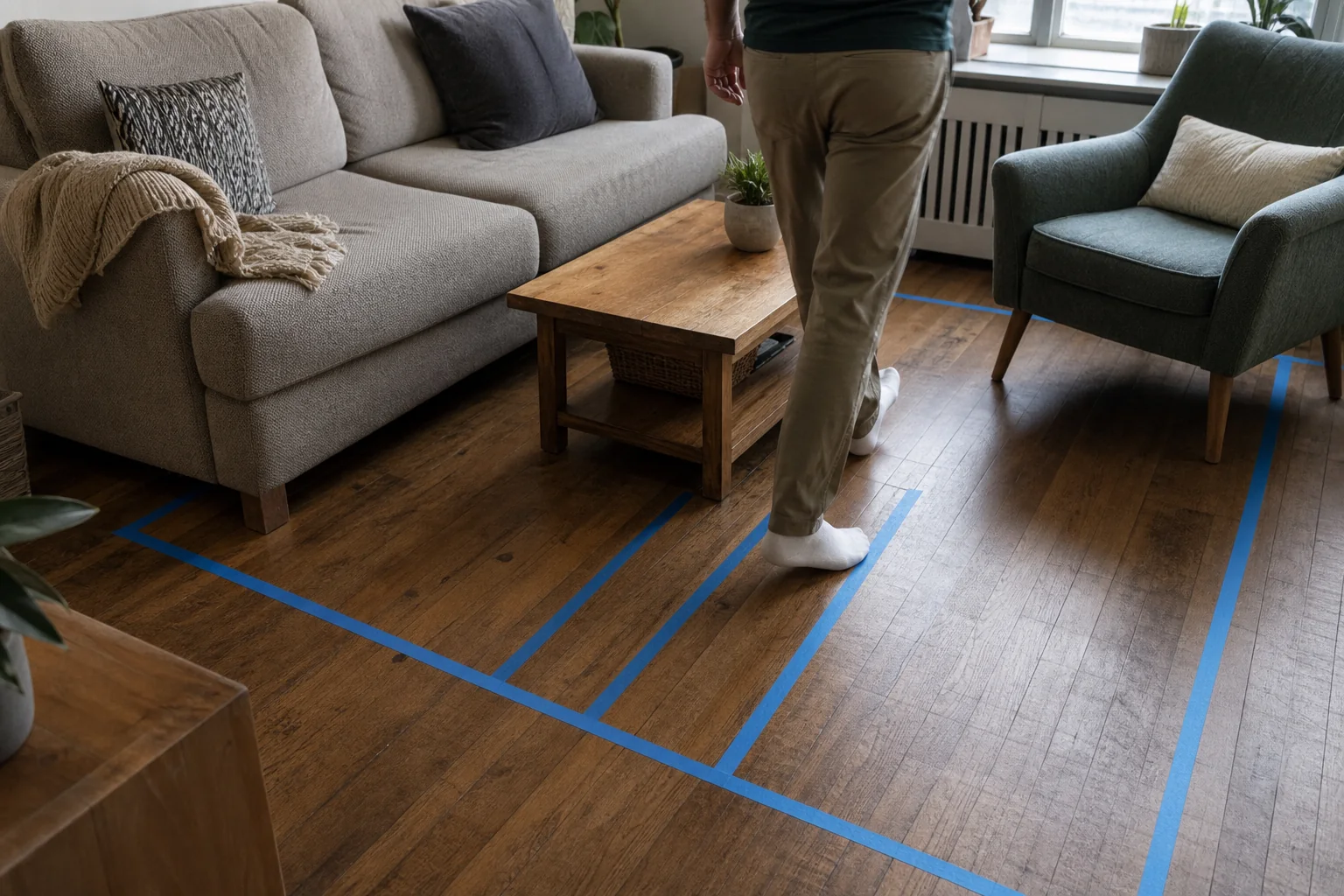
Budget fix: Rearrange before buying. Use painter’s tape to mark each proposed footprint and live with the outline for a day. It reveals blocked drawers, awkward corners and overly tight passages before your back—or your budget—pays for the mistake.
2. Interrupting the room’s natural walking route
A room feels cramped the moment you have to turn sideways, step around a coffee table or cross between the television and sofa to reach the next room. This is not only about appearance. A predictable route makes everyday life easier for children, older adults, guests and anyone carrying a tray, laundry basket or mobility aid.
Stand at the living room entrance and identify where people naturally go: another doorway, the balcony, a window, a hall or a frequently used seat. Keep that line as direct as your room allows. A practical design target for a main route is around 30–36 inches (76–91.5 cm), with more space where a person needs to turn. If accessibility is important, use applicable local standards and the user’s actual mobility device rather than relying on a generic decorating measurement.
The U.S. ADA standard’s 36-inch accessible-route width is a valuable benchmark, but it is not a blanket legal requirement for every private home. Local rules vary. Fire planning is less flexible: entrances, required exits and escape routes must not be hidden behind a chair, console or pile of baskets. The U.S. Fire Administration recommends identifying two ways out of every room where possible and keeping exits clear.
Small-room fix: Move the coffee table away from the main traffic line, choose a round or oval table where hips keep meeting corners, or replace it with nesting tables that separate only when needed.
3. Filling the room with too many undersized pieces
Floor-plan clinic
Three common symptoms have three different fixes.
A small room is not one problem; name the obstruction you can actually see.
- Doorway pinchProtect the diagonalMove the deepest piece out of the arrival line.
- Wall-huggingMake a groupBring seats into conversation range.
- Floating rugJoin the seatsLet the rug touch the main seating.
Tiny furniture does not always make a tiny room look bigger. Five little tables, two narrow shelving units and a collection of miniature chairs can create more legs, edges, shadows and unusable gaps than two or three confidently scaled pieces.
Count functions instead of objects. You may need comfortable seating for three, a place for two drinks, one reading light and concealed storage. You do not necessarily need a separate item for every function.
Look for pieces that work harder:
- an ottoman that acts as a footrest, extra seat and occasional table;
- a side table with a drawer or shelf;
- a storage bench beneath a window;
- nesting tables that expand for guests;
- a compact sofa with one generous chair instead of multiple occasional chairs.
Be equally cautious with “space-saving” furniture that is uncomfortable, flimsy or difficult to operate. A piece earns its place when it solves a real daily problem.
Renter-friendly fix: Shop your home first. A bedroom stool may become a drinks table; a dining chair may work as occasional seating; a lidded basket can hold blankets and serve as a soft-edged side surface with a sturdy tray.
4. Choosing furniture by width—and ignoring depth and visual weight
A sofa can fit across the wall and still overwhelm the room. Deep seats, thick rolled arms, a high back and a skirt that reaches the floor all add visual and physical weight. Two sofas with the same width can occupy the room very differently.
Before buying, note the complete footprint: width, depth and height. Add the space needed to recline, open a drawer or walk past it. Then mark the dimensions on the floor. If you are shopping online, tape cardboard or paper to the wall to show the item’s height as well.
In many small rooms, furniture with raised legs, slimmer arms and a little visible floor beneath it feels lighter. This is a visual preference, not a requirement. A grounded sofa can look beautiful when the rest of the room is calm.
Prioritise comfort where it matters. A too-shallow sofa that nobody enjoys is wasted space. You might choose one comfortable, moderately deep sofa and save space elsewhere with an armless chair, wall-mounted lighting or a smaller side table.
5. Floating the furniture around a rug that is too small
A small rug placed alone beneath the coffee table can make the seating look like separate islands. The eye reads every exposed gap, so the room feels more fragmented.
As a flexible starting point, choose a rug large enough for the front legs of the sofa and main chairs to rest on it. In some rooms, placing every seating leg on the rug creates the most unified result. In others, especially narrow rooms, a properly centred rug with a consistent border looks better.
Try to leave a deliberate strip of visible floor rather than a random sliver. Around 6–12 inches (15–30 cm) can work in a compact room, but architecture should lead: centre the rug on the seating group, not automatically on the entire room.
If a larger rug is not affordable, layer a smaller patterned rug over a larger plain flatweave, or rotate the existing rug to see whether its proportions work better. In hot climates, humid regions or homes where rugs are impractical, create the same sense of unity through furniture placement and a repeated colour palette.
Use a suitable rug pad or local anti-slip solution, keep edges flat and avoid placing a curled corner in a walking route.
6. Letting the television control every decision
The television is often part of real life, and hiding it is not a moral achievement. The problem begins when every seat lines up formally toward the screen and people cannot comfortably look at one another.
First, give the room a second point of interest: a window, artwork, shelves, a plant grouping or simply the conversation area itself. Angle at least one chair toward the sofa while keeping a reasonable view of the screen. A swivel chair is especially useful in a room that switches between film night, conversation and reading.
A low media unit usually feels less imposing than a tall wall of storage. If you wall-mount the television, follow the manufacturer’s mounting, ventilation and viewing guidance. Do not place it where cables cross a route or where furniture blocks a heater, air-conditioning unit or escape opening.
No-renovation option: Paint or style the wall behind the television in a deeper, quiet colour so the black screen recedes. Keep accessories restrained; a crowd of tiny objects around a screen creates more visual noise, not less.
7. Relying on one overhead light
Visual weight map
Balance is read from floor to eye level.
Distribute large, medium, and light elements instead of filling every empty edge.
- FloorRug + clear routeOne calm connected base.
- SeatSofa + chairThe main visual mass.
- Eye lineLamp + artA few lighter vertical notes.
A single bright ceiling fixture may illuminate the floor, but it often leaves corners flat and faces shadowed. At night, those dark edges make the room feel as if it ends sooner.
Think in three simple layers:
- Ambient light provides a comfortable overall glow.
- Task light supports reading, crafting or working.
- Accent light softly highlights art, a plant or an architectural feature.
You do not need three new fixtures. A ceiling light, one floor lamp beside the sofa and a small lamp on a shelf can create depth. Choose bulbs with compatible colour temperatures so the room does not look accidentally divided into blue and yellow zones.
Where floor space is scarce, use a slim lamp that tucks partly beneath furniture, a plug-in wall light, or a rechargeable light approved for its intended use. Secure trailing cords and never overload outlets or conceal unsuitable electrical connections beneath rugs.
Budget fix: Move an existing lamp before buying another. A light placed in the darkest corner often changes the room more than a stronger bulb in the centre.
8. Hanging curtains low, narrow or heavily across the glass
When a curtain rod sits directly on the window frame and the fabric covers much of the glass even while open, the window appears smaller and the room loses useful daylight.
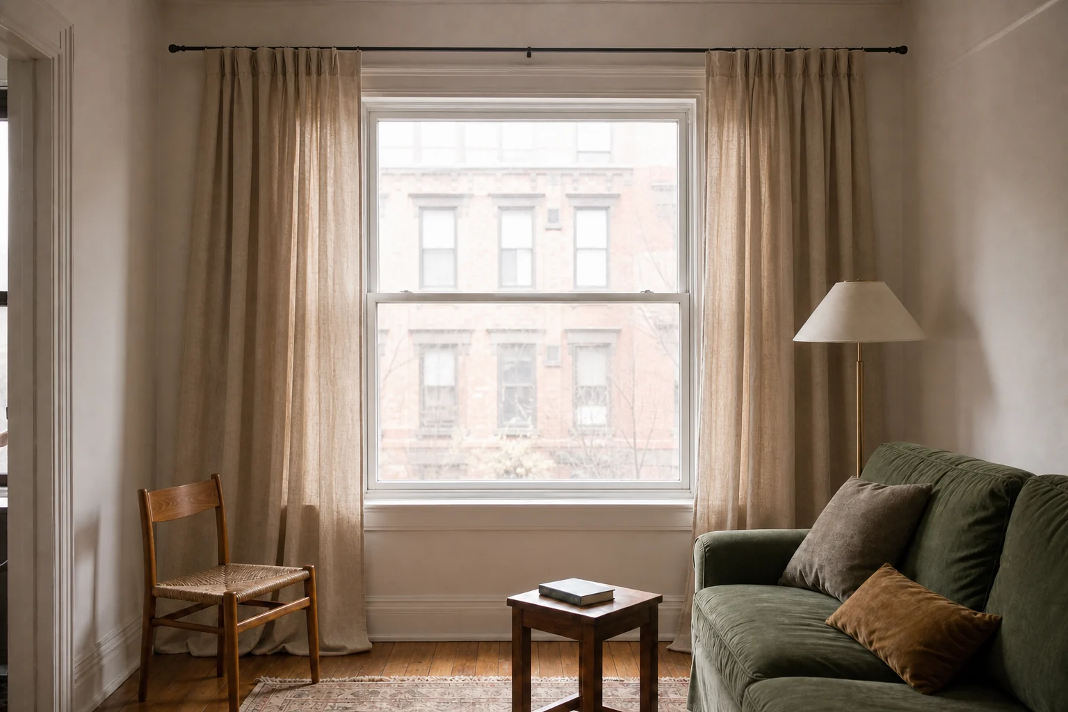
Where the wall and hardware allow, mount the treatment above the frame and extend it beyond each side so more fabric can sit beside the glass. A useful starting range is roughly 4–8 inches (10–20 cm) beyond each side, but the correct amount depends on the window, wall, curtain fullness and nearby obstacles.
Full-length curtains can create a calm vertical line, but they should not cover a radiator, heater, air-conditioning intake, floor vent or required exit. In damp or very dusty climates, washable shades or lighter panels may be more practical than pooled fabric.
Renter option: If drilling is prohibited, consider a tension system made for the window, removable brackets rated for the curtain’s weight, or a simple blind. Never rely on a light-duty adhesive fitting for heavy rods or fabric.
9. Filling every wall, shelf and tabletop
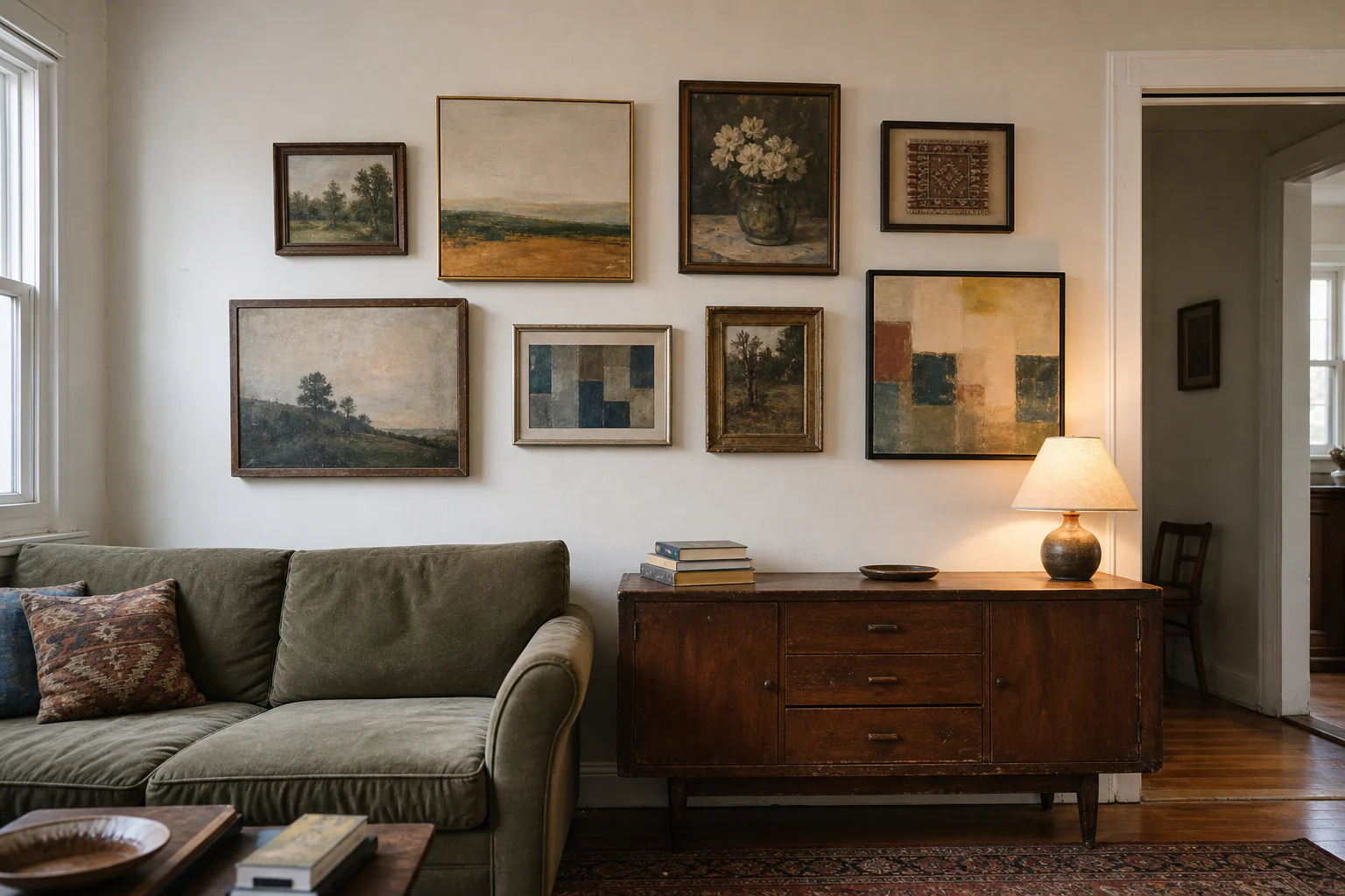
Small rooms need personality, not sterility—but personality is easier to appreciate when objects have space around them. If every surface holds a row of decor and every wall contains several unrelated focal points, the eye keeps stopping. The room feels busy before daily life adds a mug, a bag or a toy.
Edit in groups. Instead of scattering ten small objects, display three or four pieces with a shared story: books you use, one framed photograph, a lamp and a natural element. Vary their height and leave part of the surface empty for life to happen.
Use closed storage for visually noisy necessities and open storage for items worth seeing. A single tall cabinet can be calmer than several small units, provided it is safely secured and does not dominate the only clear wall.
Do not confuse “minimal” with impersonal. One large artwork, an inherited textile, a beautiful bowl or a favourite colour can give the room more life than a collection of generic accessories. The most spacious-looking room is not necessarily the emptiest; it is the one where every visible thing feels intentional.
A step-by-step small living room layout reset
You can complete this reset with your existing furniture. Set aside two or three hours, take a before photo and resist buying storage until the final step.
-
Decide what the room must do
List the room’s three most important activities in order: conversation, television, reading, children’s play, work, dining or something else. Your top activity receives the best space; occasional activities should use flexible furniture.
-
Measure the fixed elements
Record the room, door swings, windows, outlets, heaters, vents and built-ins. Mark any area that must remain accessible or clear for safety.
-
Protect the main route
Use tape to mark a direct walking path between entrances and frequently used destinations. Test it while carrying something bulky. Widen it for the people who actually use your home.
-
Place the largest seating piece
Position the sofa so it supports the main activity without blocking the route. Try both the wall and a slightly pulled-forward position before deciding.
-
Create connection with the second seat
Angle a chair toward the sofa instead of automatically lining it against another wall. Make sure the sitter can reach a surface and light.
-
Set the useful centre
Place the coffee table around 14–18 inches (36–46 cm) from the sofa as a flexible starting point. Adjust for leg length, mobility needs and how the table is used. If the passage becomes tight, use a smaller round table, ottoman or nesting pair.
-
Unify the seating
Position the rug in relation to the furniture group. Aim for front legs on the rug where practical and check that no edge creates a trip point.
-
Add light at two or three heights
Turn on the room at night. Place task lighting where an activity happens and use a second light to soften the darkest edge.
-
Return only useful or meaningful objects
Add daily necessities first, then a small number of personal pieces. Leave room for a drink, book or bag instead of styling every centimetre.
-
Take an after photo—and subtract one thing
A photograph makes cluttered corners and awkward gaps easier to spot. Remove the weakest item, then live with the layout for a week before shopping.
Frequently asked questions
Should a sofa touch the wall in a small living room?
It can. If placing the sofa against the wall protects the walking route and creates comfortable seating, it is a sensible choice. Try a small gap of 3–6 inches (8–15 cm) only if it adds depth without wasting needed floor space.
How much space should be between a sofa and coffee table?
About 14–18 inches (36–46 cm) is a useful decorating starting point. Increase it for easier movement or mobility equipment; reduce it slightly only if everyone can sit, stand and pass safely.
What if the living room is also a dining room or home office?
Give each activity a defined zone, but avoid duplicating furniture. A drop-leaf table can act as a desk and dining table; an ottoman can provide seating and storage. Protect the route between zones and keep the least frequent use flexible.
Does all furniture need to sit on the rug?
No. All legs on the rug creates a luxurious, unified look, but front legs only often works well in small rooms. Consistency matters more than following one formula.
How can I improve a dark small living room without painting it white?
Light the corners, uncover more window glass, repeat a few lighter tones and use reflective finishes selectively. A deep wall colour can still feel spacious when the circulation, lighting and visual hierarchy are clear.
What should I prioritise for an accessible living room?
Start with the person and their actual needs: a clear route, sufficient turning space, stable seating at a usable height, reachable controls and unobstructed door manoeuvring space. Consult applicable local standards or a qualified accessibility professional for required dimensions. Generic furniture-spacing advice is not a substitute for an individual assessment.
A small room should feel edited—not restricted
The best small living room layouts are not built from tricks. They are built from priorities: a clear way through, a comfortable place to sit, enough light to use the room well and objects that mean something to the people who live there.
Begin with the route, place the largest piece with intention and let the remaining furniture earn its footprint. When movement becomes easier and the eye has somewhere to rest, the room often feels larger before you remove—or buy—a single thing.
About the visuals in this guide
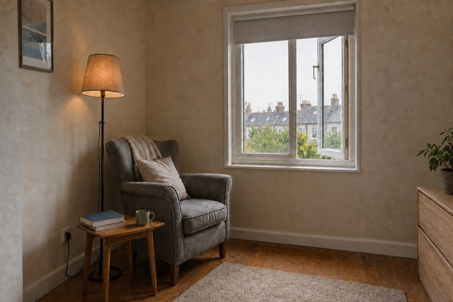
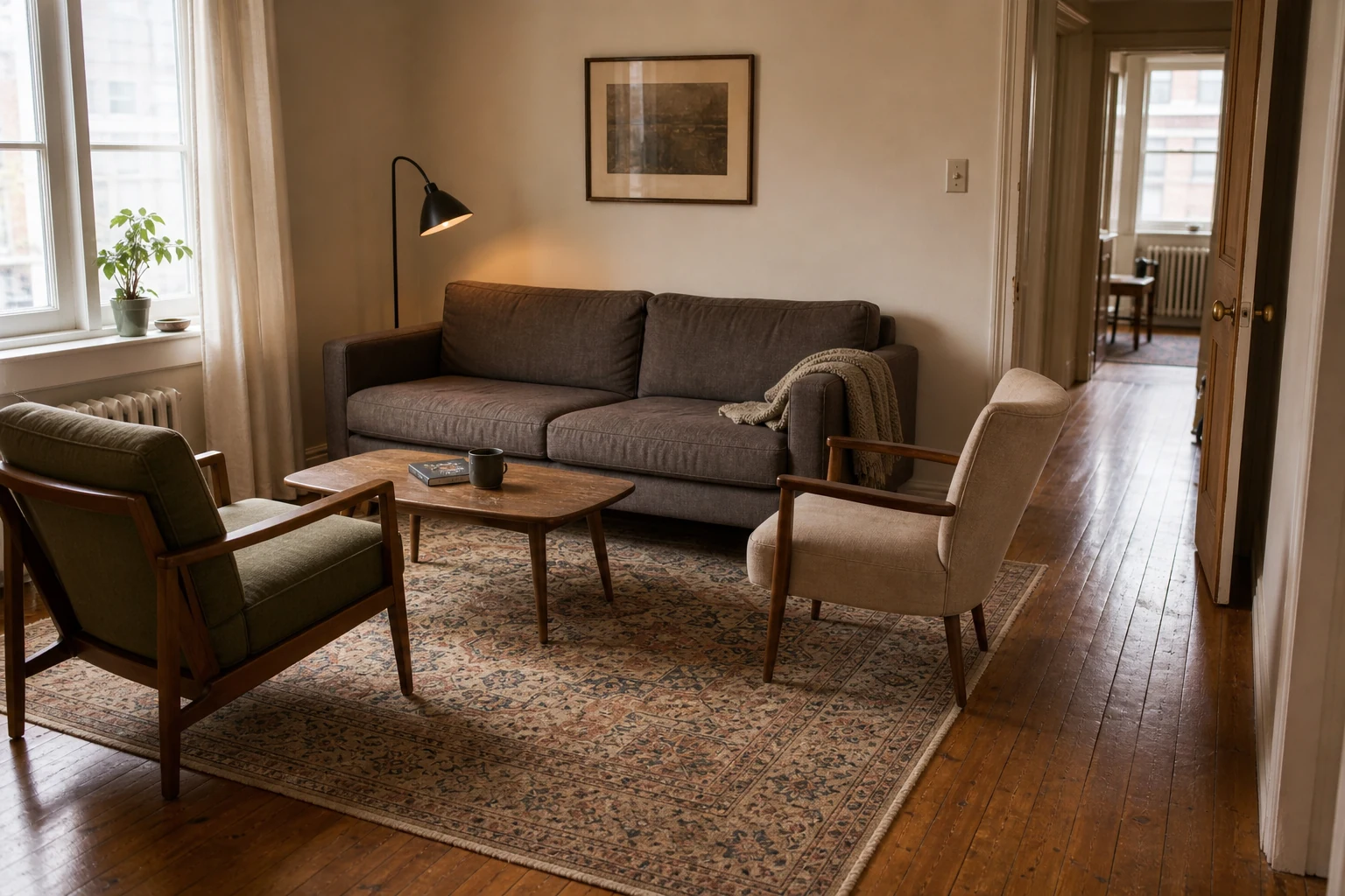
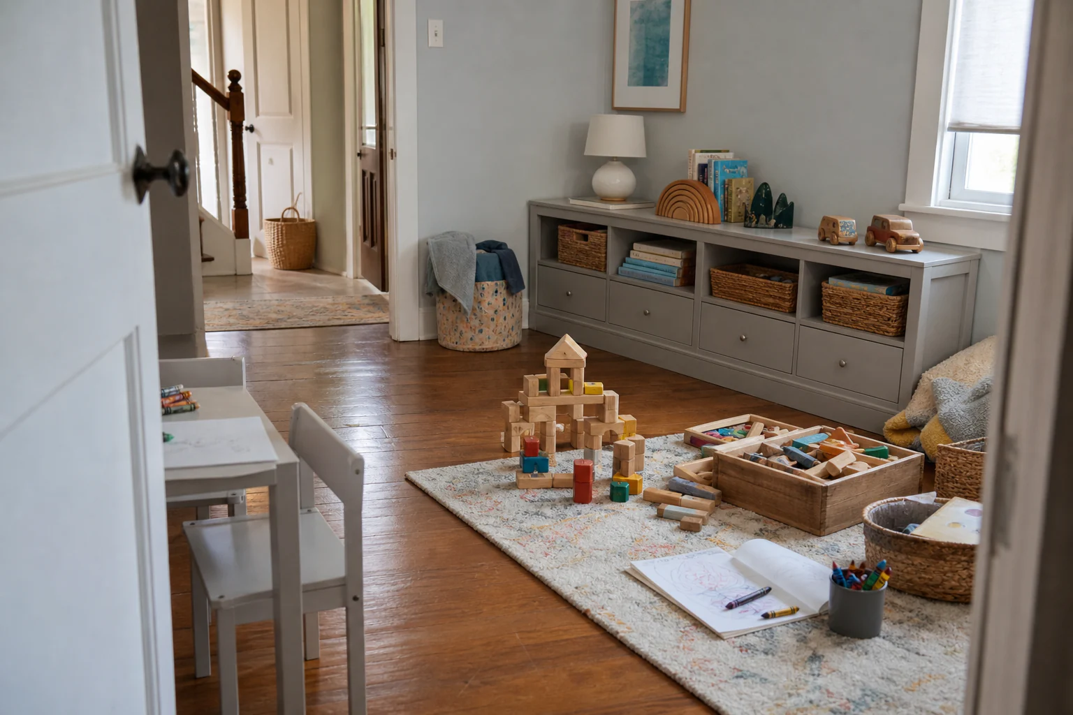
These are original Dealsmaster editorial illustrations produced with AI assistance for explanation and inspiration. They do not document a real household, tested installation, reader result, or professional inspection.
Safety and accessibility sources
- U.S. Fire Administration: Home Fire Escape Plans
- U.S. Fire Administration: Home Fire Safety—Keep Exits Clear
- U.S. Department of Justice: 2010 ADA Standards for Accessible Design
- U.S. Department of Justice: ADA Title III Regulations and Private Residences
- U.S. Consumer Product Safety Commission: Anchor It! Furniture and TV Safety
- UK Government: Approved Document M—Access to and Use of Buildings
Editorial note: Safety, fire and accessibility rules differ by jurisdiction and property type. Check the requirements that apply to your home before altering fixtures, escape routes or accessible features.